III. Visualizations
Dimension Reduction
a. Multidimensional Scaling (MDS)
Code for the graph: Github Link
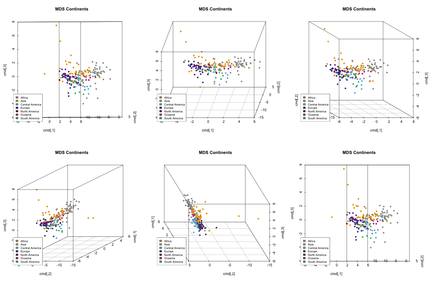
Continents presented in 3D space
In order to provide a general insights into the data, all countries were presented in 3-dimensional space. At the first glance clusters between continents can be seen. Countries which are in the same continent in general present a similar profile.
b. Principal Components Analysis (PCA)
Code for the PCA: Github Link
Interpretation of PC1, PC2, and PC3 are as follow:
PC1: highly loaded in variables such as number of phones, life expectancy, Corruption index, Acces to the Internet and Income.
PC2: highly loaded in the number of suicides and sex ratio.
PC3: especially meaningful in the context of inequality.
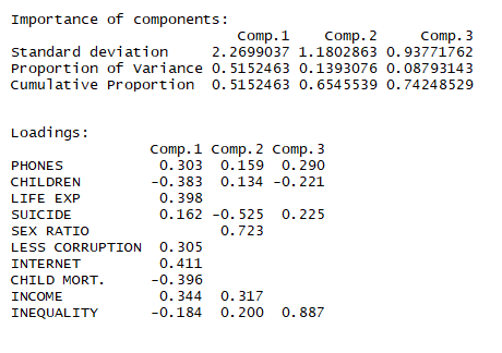
Summary Result for the first three Principal Components.
Plot PC1 vs PC2
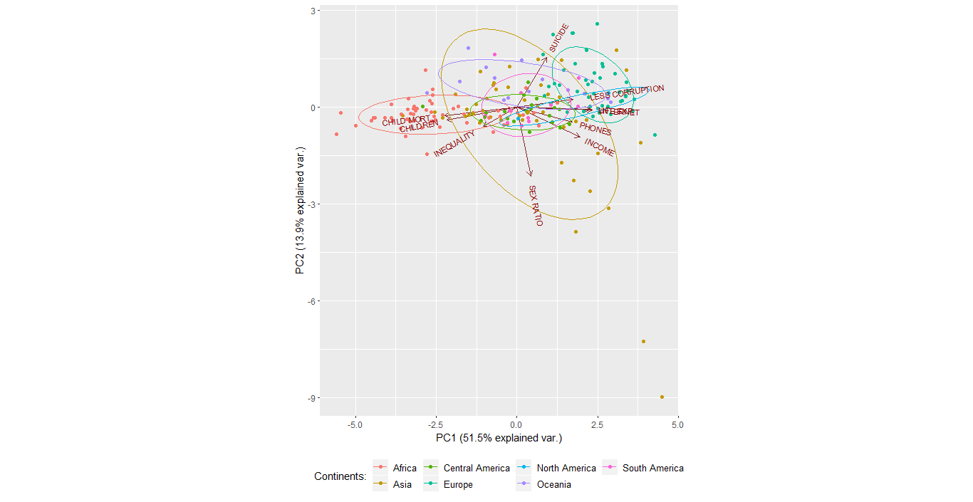
On the right side of the plot with a high value of PC1 high developed countries in Europe and North America can be spotted. Those countries are above the average in the context of Less corruption, Life expectancy, Internet access, number of phones and income.
On the left side of the plot, with a low value of PC1, less developed countries in Africa can be spotted. Those countries are above the average in the context of high child mortality, a number of children per woman and inequality.
Interesting phenomena is presented by looking at Asia. The continent is the most diverse among all of the others in both directions PC1 and PC2. Some countries in Asia are highly developed while others are rather poor (PC1). In the context of PC2, some countries have extreme value for sex ratio (men outnumber women significantly). Those countries are, for exampe Qatar and the UAE.
Plot PC1 vs PC3
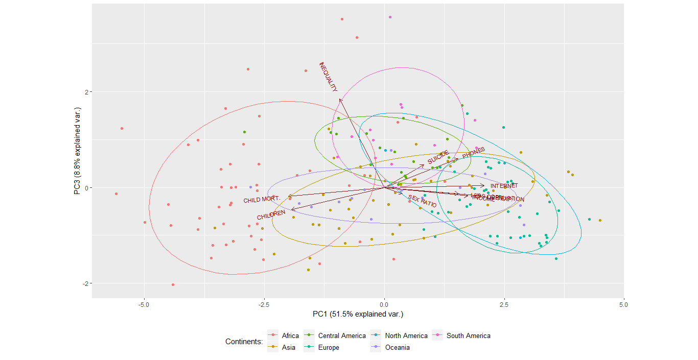
The second plot shows that very high inequality is presented especially in South America and Africa
A high correlation between variables: number of phones, less corruption, Internet access and income. Another group of highly correlated variables are child mortality and a number of children per woman.
PCA on the World Map
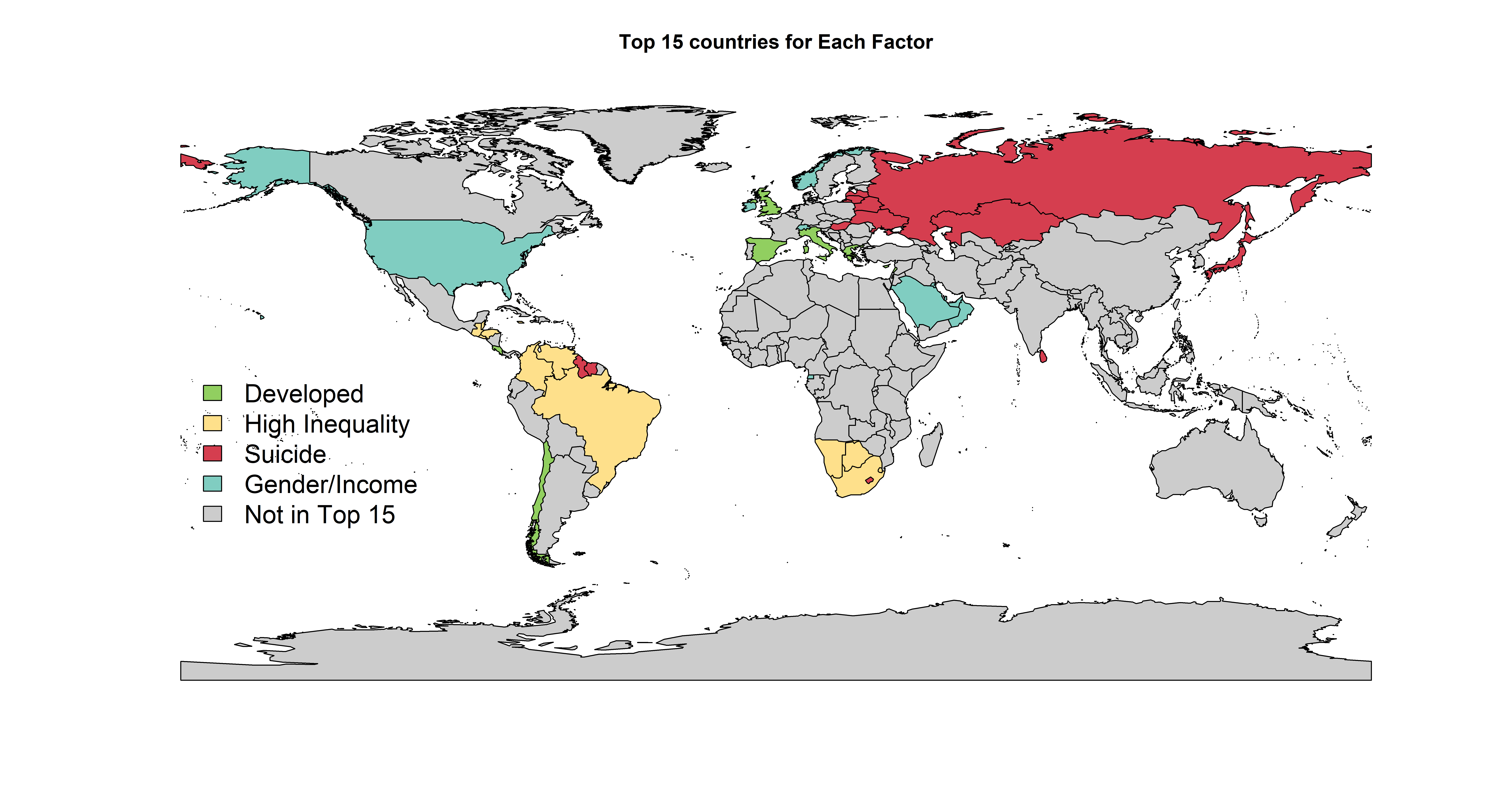
In order to show which countries are the highest in what Principal Component the World Map was presented. From each component (PC1, PC2, and PC3) top 15 countries with the highest loading in each group were chosen and plotted on the map.
# PrinCompPlot <- PCA(cleaned)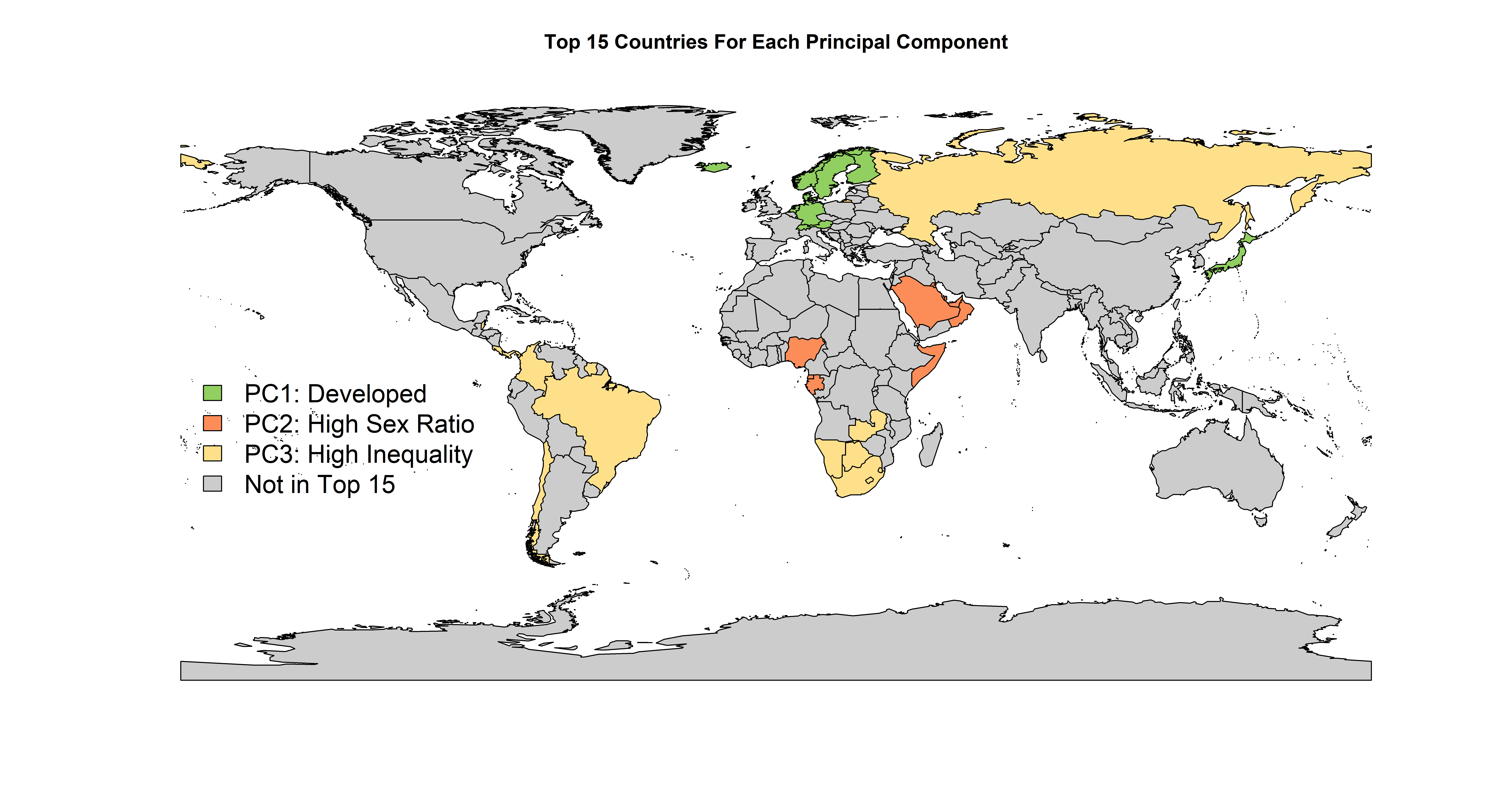
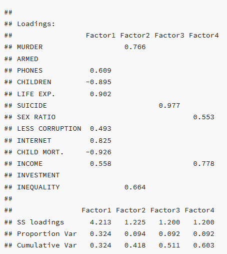
Note: from the analysis columns such as number of murder, number of armed forces and percentage of investments are excluded. Those variables had a low correlation with the rest of the columns and much more dimensions would be needed to explain the data. As such data would not be possible to be well explained on the 2-dimensional plot.
Cluster Analysis
Different Cluster Analysis techniques were introduced in order to find similarities between continents and countries and form groups.
Hierarchical Clustering between Continents
Code for the graph: Github Link
library(ape)
source('cluster_continents.R')
# Cl_continents <- cluster_continents(cleaned)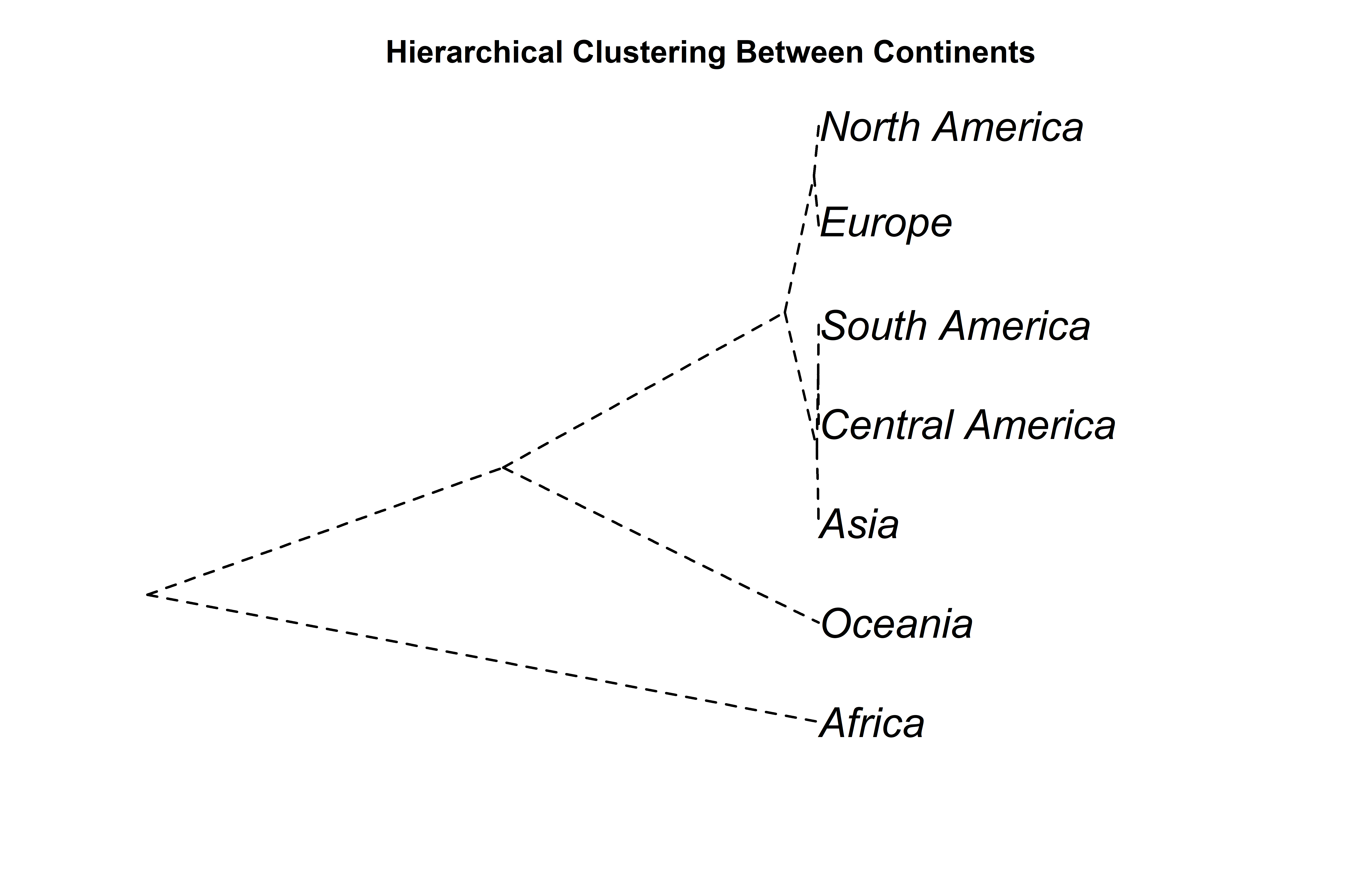
The hierarchical model above shows that the data has three main clusters. The first cluster includes North America, Europe, South America, Central America, and Asia while the second includes Oceania, and the third, Africa. The interesting thing is that Oceania is not clustered with the developed countries like North America and Europe despite it contains countries such as Australia and New Zeland. This is more than likely due to the reason that Oceania also has many small islands included in the continent that are not as developed.
K-means and Model-Based Clustering between countries
Code for the graph: Github Link
library(mclust)
source('clusters_countries.R')
# Cl_countries <- clusters_countries(cleaned)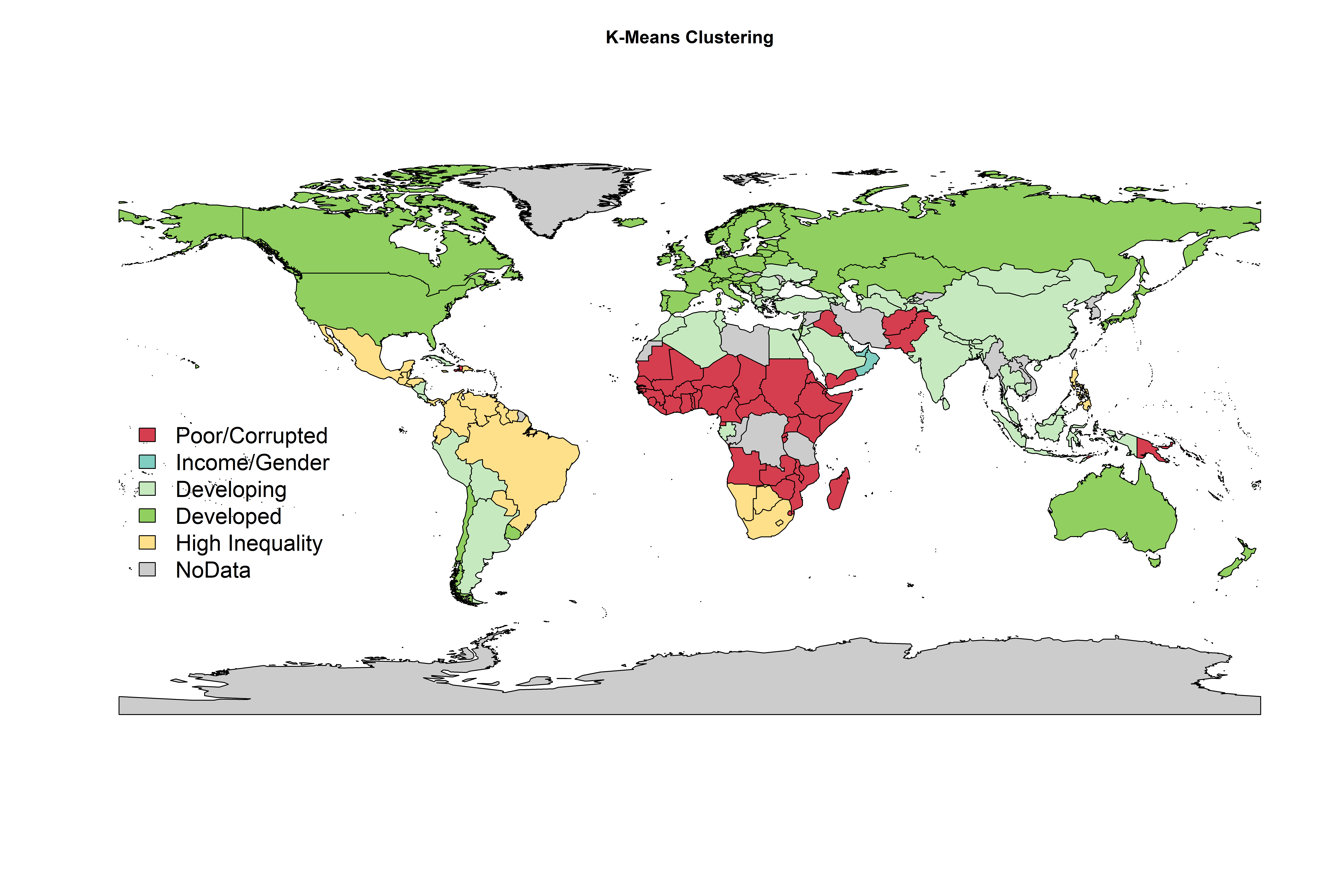
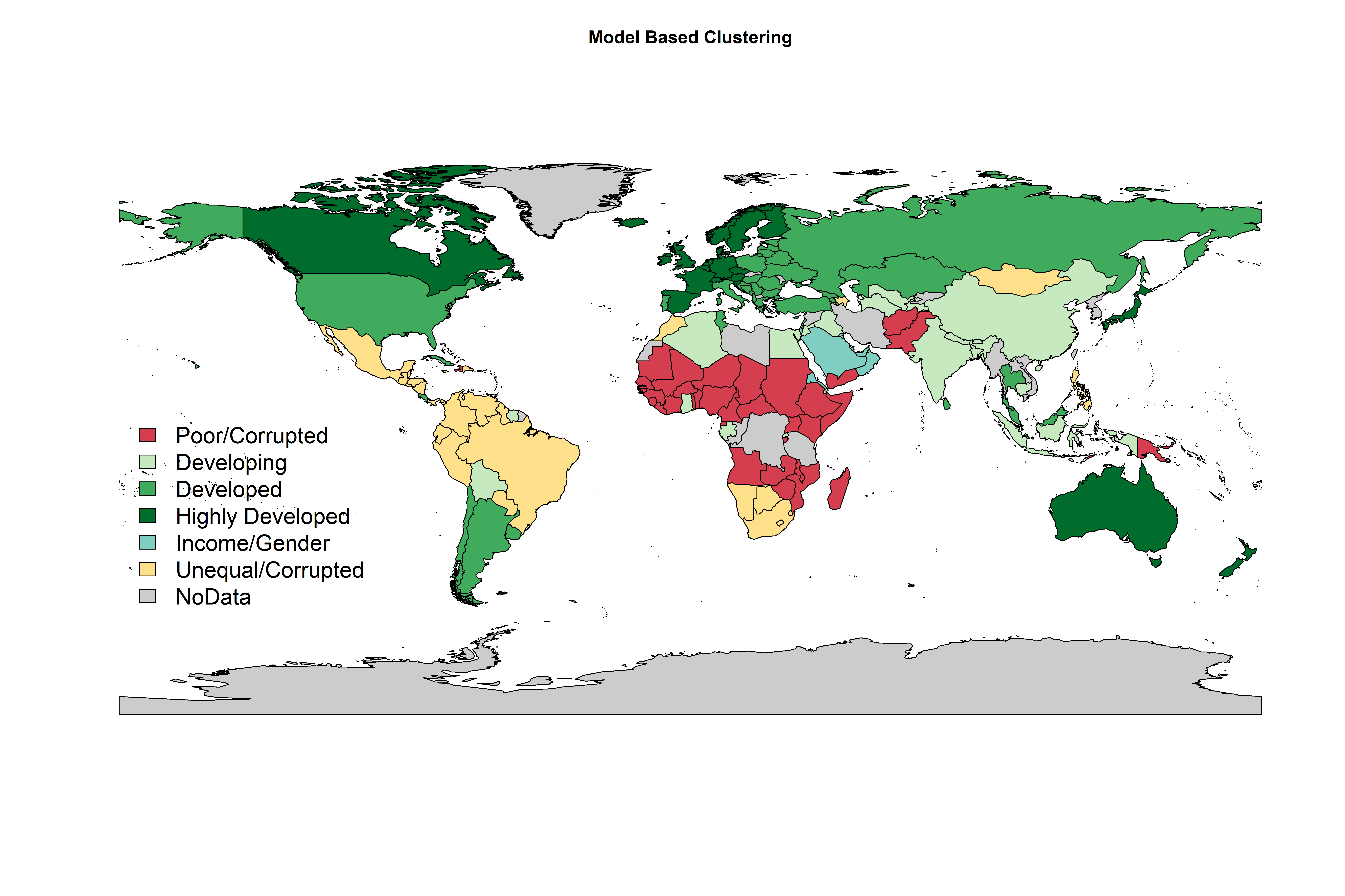
In the case of K-means a scree plot suggests that countries should be divided into 5 groups. The Model Based algorithm decided the number of groups automatically, as such 6 groups were created.
The developed countries that were observed in the K-means model were splited into three separate groups under the Model-based method, appropriately labeled developing, developed, and highly-developed.
The poorer, less-developed countries like those found in Africa remained consistent between the two clustering techniques.
A comparison of the chi-squared test was performed to determine if a dependency between groups and continents existed. The results suggest that Model-based groups are more similar to continents. The chi-squared test is significant in both methods indicating dependency between the groups and continents. However, for K-Means method, X-squared is equal to 236.76, while for Model-Based method, X-squared is equal to 272.71.
